A timeline is a nice representation of events in time. A timeline can also be a useful tool since it can provide new insights because you can view the data in a different perspective. For genealogists, the timeline can be useful too! For a while now, I had the idea to combine the timeline with a pedigree chart.
Timelines
A timeline is a graphical representation of a chronological sequence of events or time periods. This view has the form of a bar and has timestamps with inscriptions or captions.
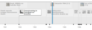
You can create timelines yourself through services like TimeToast, TimeRime or Tijdbalk.nl (of which you see an image below). On these websites you have to manually enter the data yourself.
The timeline in genealogy
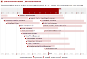
On Genealogie Online the timeline is used to give more insight into the life of a person. Below is an example of Willem Frederik Lamoraal Boissevain. The red rectangle depicts the life of the person, below the lifespans of grandparents, parents, brothers / sisters and children are put in the timeline. It reflects what the person experienced in terms of births and deaths and who lived in the same time.
The pedigree chart
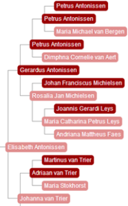 A pedigree chart is a representation of all direct ancestors in the male and female lines or a person.
Although you can show birth and death dates, in both textual and graphical pedigree chart, is it difficult to see the overlap in lifetimes. This is where the idea of combining the pedigree chart with the timeline hit me.
The pedigree-timeline
The pedigree-timeline shows both the relationships between child and parents and the lifespans of all the ancestors. The following image was the first sketch of a pedigree-timeline.
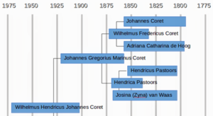
Although the combination is correct, it’s somewhat hard to read this representation. Because the proband is left and also the most recent time, the bars start at the death and finish at birth. Not logical … so let’s turn it around!
The first prototype
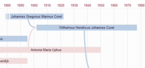
The first sketch was made in a drawing program, but a prototype followed (image show above). This was a working prototype of the pedigree-timeline, one you can view in the browser.
In this prototype, there are also several types of bars (not present in the first sketch). Of some ancestors you might not know the date of birth or death. This is shown with a striped beginning or end. It may also be that the pedigree-timeline was based on a living person and/or that ancestors are still alive. In that case, the “lifespan bar” ends with a triangle. Finally, the bars are coloured pink or blue to indicate the sex.
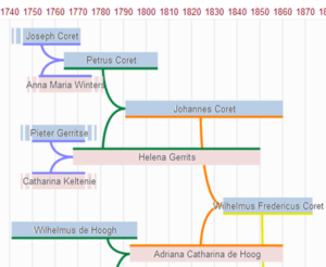
Second prototype
In a pedigree chart you can easily distinguish the generations, in the first sketch and prototype of the pedigree-timeline this was less visible, you missed it. This was fixed in a second prototype by using separate colours for each generation.
Data requirements
To create a pedigree chart you only need information about the names and the child-parent relationships. A pedigree-timeline requires more: information about birth / baptism and death / funeral. Only this lifespan information can be put as a bar in the timeline. The timeline can handle approximate dates, but you have to be able to estimate lifespans.
This is an additional challenge which became very apparent when I tried to generate the data for the pedigree-timeline.I try to generate this dataset from a GEDCOM file. If no date of birth is known we have make an educated guess to find a minimal year of birth. This can done by looking at the wedding and assume the person was at least 18 years at that data. Or by looking at the dates of birth of the children. A similar set of estimation rules has been drawn up to determine dates of death.
Based on these estimates approximate lifespan bars can be put in the pedigree-timeline. When no dates are available and can’t be guessed, then these persons are not shown in the pedigree-timeline!
The future of the pedigree-timeline
The development of a new type of genealogical graph, from idea through sketches to working prototypes has been fun, hence this article.
The technology is not yet finished completely, eg. it doesn’t work well/smoothly on tablets. But I hope that this new genealogical chart will soon be available on Genealogie Online. Then, you’ll find the pedigree-timeline next to the ‘pedigree on the map‘ chart!
And who knows, maybe other family tree websites and programs will also include the pedigree-timeline…
This article is a translation of Ontwikkeling van de kwartiertijdbalk.